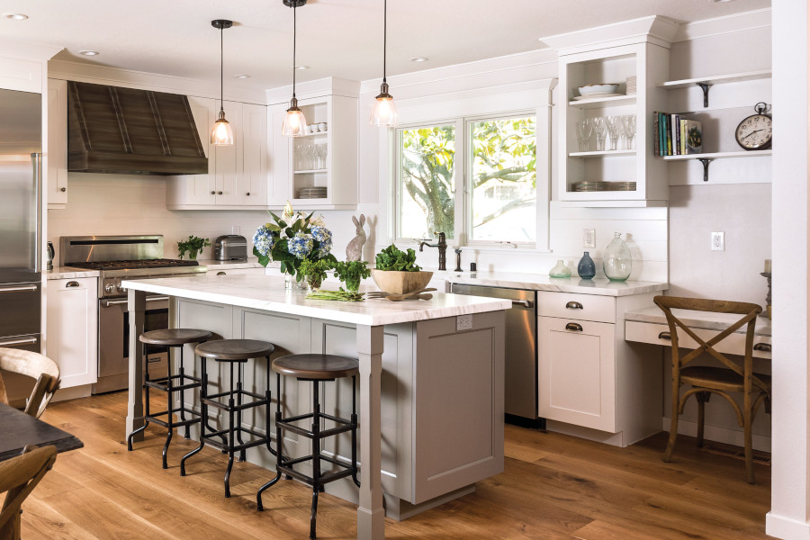
Simple and genius ways on how to infuse cheerful tones to your cooking space

Decorative Wall Tiles
Atlas Concorde – Dots Pece
It is indeed easy to fall in love with the timeless allure of neutrals. Imagine—classic earth colors, punctuated with the drama of cappuccino and the very vigilant addition of deep greens—understated luxury. Yet, with everything that we’ve collectively gone through, welcoming 2021 with bright hues seems to be in order. Along with the new calendar, a new design consciousness is taking shape characterized by an unabashed use of jovial colors.
The kitchen joins the rest of the home in this much-needed upgrade, and we are not talking about just hanging a “colorful” painting. From accessories and fixtures, to furniture pieces, to high-ticket items, here are five ways on how to celebrate life with happy colors.
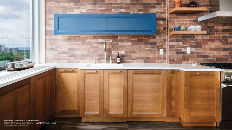
1. Decorative Backsplash
Turn your backsplash into a work of art by installing decorative tiles instead of the usual white tiles or normal paint. This move also gives the space an additional visual interest and an effective conversation starter.


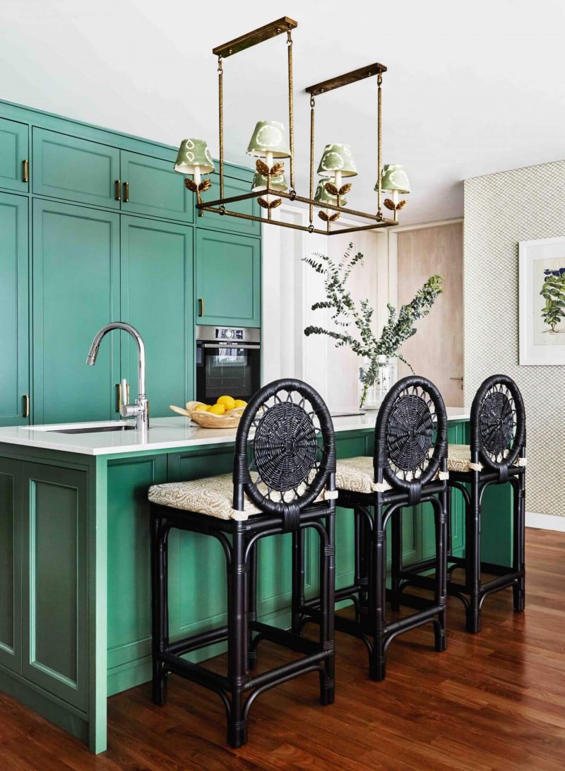
2. Horizontal Sunshine
Break the monotony of neutral kitchen cabinets with a surprising hue. Try Mami Vena from Silestone’s latest color collection. Complete the surprising element with an intriguing edge style. We love the Waterfall and Dupont.
Indisputable leader in countertops for 25 years, Silestone is made of more than 90% of natural quartz which means it possesses strength in its surfaces, providing outstanding resistance and durability properties that you need in your home. These characteristics provide the best option not only for your kitchen but also in bathroom, floors and cladding. Discover its colors, textures and formats through Euroluxe Cabinets.
Silestone – Miami Vena
3. Decorate with Light
The worn-out appeal of the industrial look is so 2020. It is high time to become more adventurous with choices. Explore the possibilities of using painted finishes for your lighting options. Think Ocean Blue crystal pendant and walnut cabinets for Urban Chic feel, or Apple Green filigree and Eggshell cabinets for an updated country vibe. This vibrant kitchen in Singapore by E&A Interiors employs green hues.
4. Use Pantone’s Colors of the Year
For 2021, Pantone announced two colors to ring in the New Year—Illuminating and Ultimate Gray. For those who are wary of infusing unusual colors to their cooking domain, this combination maybe a good start because this yellow is equal parts cheery and subdued while the gray is a refreshing brand of neutral teeming with elegance. Include these colors through accessories such as bowls and vases, then slowly work your way up to furniture pieces.
Atlas Concorde – Amber Floors
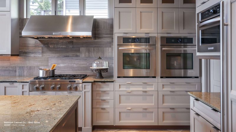
5. Don’t Forget the Cabinets
Can you use bright tones for your kitchen cabinets? Absolutely! The 1900 Series of Bellmont Kitchen Cabinets has a paint finish with a plethora of colors from the classic choices, to jewel brights, to deep tones. We love the Monterey with its shaker-inspired door style done in solid one-piece construction, which eliminates joint seams that allow the finish to stand the rigorous requirements of a busy kitchen.
Color with Synchrony HOME Credit Card
Euroluxe Cabinets, Inc., is a proud partner of Synchrony HOME Credit Card to help you achieve the kitchen of your dreams. Apart from flexible terms, it offers 24/7 secure account management so you can start coloring your cooking space without any worries.
Ready to start your kitchen project and raise the overall value of your entire home? Talk to us today and we will help you every step of the way. Euroluxe Cabinets, Inc. is an official distributor of Bellmont Cabinets and other kitchen essentials including Silestone Countertops, Hallmark Floors, and Miele Appliances.